
About Us
MA Media is a creative studio focused on web design and graphic design. We help businesses build a clearer, more professional presence through thoughtful websites, visual identity, and supporting design materials.
Founded in Vikersund, Norway, MA Media works with clients in both Norway and the US market. Our approach is collaborative, detail-oriented, and centered on creating work that feels clear, consistent, and aligned with your brand.
Meet the team
MA Media is built around close collaboration, thoughtful design, and practical execution. We work together to create websites and visual materials that help businesses present themselves clearly and professionally.

Mats Myhre
CEO
Genna Myhre
Content Manager

Olha Havrylova
Graphic & Web Designer

Mats Myhre
CEO

Genna Myhre
Content Manager

Olha Havrylova
Graphic & Web Designer
What we value
We care about design that is clear, practical, and aligned with the business behind it. Our work is guided by a few simple principles.
Clarity
We believe good design should make your business easier to understand.
Consistency
We create visual work that feels cohesive across your website, brand, and supporting materials.
Thoughtfulness
We pay attention to the details, so the final result feels intentional, polished, and aligned with your goals.
Let’s build something clear and professional
If you need a website, visual identity, or graphic design support, we would love to hear about your project.
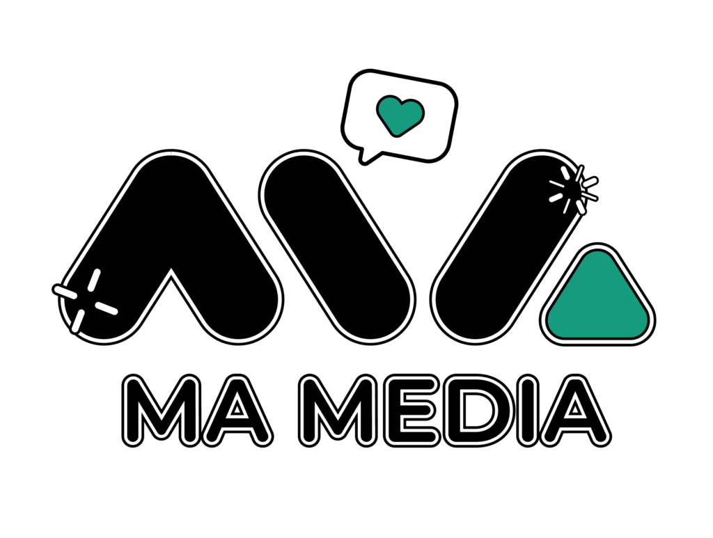
Our Logo: The Essence of MA Media
The MA Media logo is a visual testament to our foundational principles and the forward-thinking approach we champion in the realm of marketing. It’s a symbol where each element is meticulously crafted, carrying with it a story of strength, creativity, and innovation.
Bold Typography:
The ‘M’ and ‘A’, boldly cast in black, stand as pillars of strength, professionalism, and reliability. These are not mere letters but the initials that subtly pay homage to our founder Mats Alexander Myhre, whose vision and dedication are the driving forces behind our brand. The assertive lines and modern sans-serif font reflect our commitment to making a significant impact in the market while remaining accessible and
forward-thinking.
The Green Triangle:
A solitary green triangle interrupts the flow of black with its vibrant hue, a beacon of growth, creativity, and dedication. It is strategically placed to signify the apex of success—a goal we strive to achieve with and for our clients. This element of our logo represents our constant pursuit of fresh, innovative solutions and the flourishing partnerships we seek to cultivate.
A Harmony of Contrasts:
Our logo’s contrasting shapes and colors mirror the balance MA Media maintains between time-tested methods and cutting-edge strategies. The stark black symbolizes the solid foundation from which we operate, the green encapsulates our dynamic and progressive ethos, and together, they illustrate the synergy that propels businesses forward.
Global Reach with a Personal Touch:
While the ‘M’ and ‘A’ connote a global outlook, ready to engage with an international clientele and especially resonate within the vibrant US market, the overall design maintains a personal touch reflecting our local Norwegian roots and Mats Alexander’s original ethos. It’s this blend that enables us to craft compelling narratives that resonate across cultures and borders.
The MA Media Promise:
More than a symbol, our logo is a promise—a commitment to unwavering quality, to staying ahead of trends, and to devising strategies that elevate your brand. With MA Media, you gain not just a marketing ally but an extension of your vision, as dedicated to your growth as we are to our own, embodied in every curve, color, and line of our identity.